HIGHER-EDUCATION / RELIGION / NON-PROFIT
Garrett is a progressive spiritually-centered servant seminary on Northwestern University’s campus.
Client: Garrett-Evangelical Theological Seminary
Role: Creative Director, Strategist, IA, UX
Team: Account Director, Associate Creative Director, Senior Designer, Senior Developer, Senior Account Manager, Project Manager, Junior Designer, Junior Developer, Client Stakeholders
Agency: Glantz
Through dedicated research and testing, the Garrett website is now an admissions tool that drives successful recruitment goals, increases annual donations, and improves alum continued education.
Supported by user interviews and higher-ed research, my direction led the team in creating a sophisticated visual identity and design system.
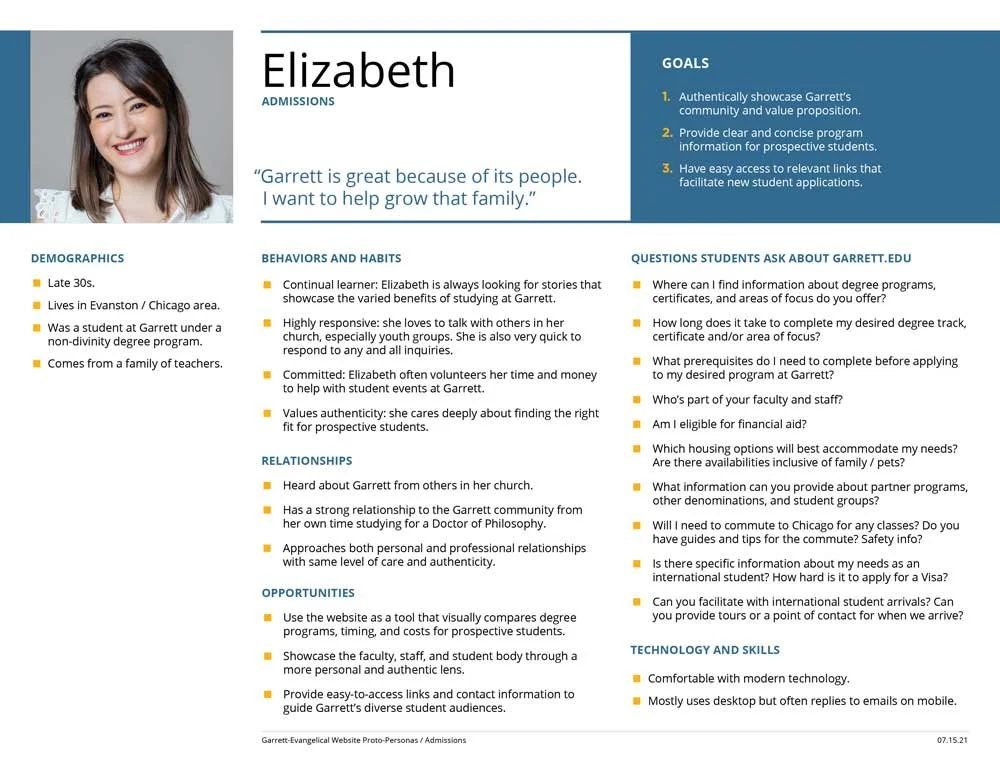
Persona Profiles to drive decisions based on real insights.
MOOD BOARDS
Our team launched the new Garrett brand identity the year prior. This project allowed us to further define the stained glass motif into a visual narrative for all marketing.
To get strategic alignment on potential concept themes, I led an engaging digital mood board session with two key stakeholders.
CONCEPTS
The chosen mood board theme was then used to craft four initial homepage designs. Led by my creative direction, the designers took the theme and came up with an interpretation of the concept with an extended UI and design system. Each presented variations in typography, color, and photography.
With various unique user flows, the targeted audiences can easily navigate the website through the menu or content-driven components.
Navigation options keep critical content themes at a high level and offer strategic access points on 2nd, 3rd, and 4th-tier pages.
Success for Garrett was distinguishing from other seminaries, increasing admission applications, generating more donations, and increasing alum engagement.
The confidence gained through our process gave me the power to make informed strategic decisions which led to a powerful and purposeful website.


